The logo, with its shape, colour and symbol is the identification card of the brand. It holds and conveys the ideas and values of founder Ezio Cristina; it tells the story of the company, identifies its mission and embodies its entrepreneurial vision.
For the last 10 years, the CRISTINA logo has been characterized by a yellow square featuring the founder’s family name. Today, CRISTINA presents a revised “ID,” the result of a creative process that has involved the company as a whole, with aesthetic and content considerations demonstrating a stronger, more homogeneous identity.
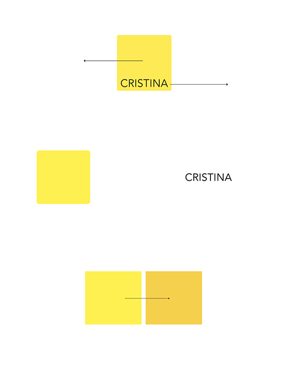
The changes introduced maintain a continuity: the central features have been retained with only the shape undergoing adjustment, the square, the colour, the name, CRISTINA, all present. Continuity meets evolution. The logo, just as the company, follows a path and changes with it.
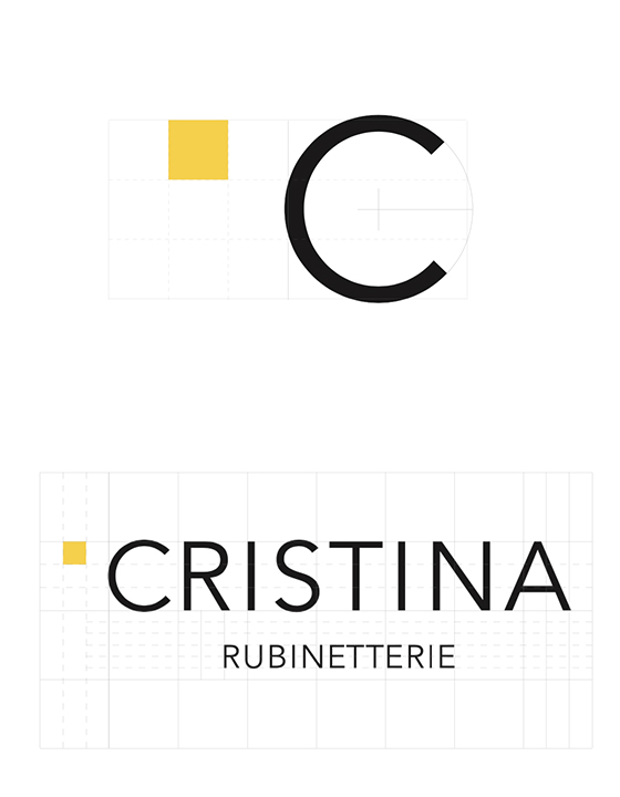
The square and the name CRISTINA stand separate.
The Square, an icon of stability, is strengthened by right angles, no longer rounded.
Yellow remains. Now in a warmer tone, it fills the square.
Each side of the square represents the fundamental principles of the company’s philosophy: experience, passion for the work, research and development and a taste for beauty.
New lettering identifies the name of the company: the C, well defined; spacing augmented to provide clarity. The company business is emphasised with the addition of Rubinetterie. Now - CRISTINA Rubinetterie, rendered in black once again.
The creation of the new logo has not been a matter of simple brand aesthetics, it has involved the entire company, from photography and catalogue design to a new temporary exhibition stand (Fiere), all renewed. The new logo expresses a desire to be immediately recognised as a key player in the sector, both within Italy and across the sixty countries in which CRISTINA is present.
.jpg)